The BasicsWhat a Look Book Is
A look book (also called a visual treatment or lookbook) is a pre-production document — usually a slide deck or PDF — that compiles reference images, color studies, and written reasoning to communicate the intended visual style of a film before production begins. It is typically built by the cinematographer, often in close collaboration with the director, and shared with department heads (production design, costume, hair/makeup, VFX) and producers so that dozens of people making thousands of individual decisions are all pulling toward the same visual target.
It is worth distinguishing two related but different documents. A director's treatment is usually broader and more prose-driven — a narrative statement of tone, themes, character psychology, and overall creative intent, sometimes written to pitch the project itself. A look book is narrower and more image-driven — specifically the visual language: framing tendencies, palette, light quality, texture, movement. In practice the two overlap and are sometimes combined into one document, but the look book is the piece that belongs most directly to the cinematographer's craft.
ContentsWhat's Typically Inside
Stills pulled from other films, photography, or paintings that capture a desired mood, framing tendency, or texture — see Composition and Shot Sizes.
Swatches or reference stills establishing the film's dominant colors and whether the grade leans warm, cool, saturated, or desaturated — see Color.
Example images defining whether the film sits in high-key or low-key territory, and how motivated the lighting should feel — see Lighting.
Decisions on aspect ratio, anamorphic vs. spherical glass, and typical focal range, with the reasoning behind each — see Lenses and Aspect Ratio.
Whether the film favors locked-off, formal compositions, naturalistic handheld work, or fluid Steadicam/gimbal movement — see Movement.
Annotated stills or storyboard frames showing how a handful of pivotal scenes might actually be shot, translating mood-board ideas into concrete shot choices.
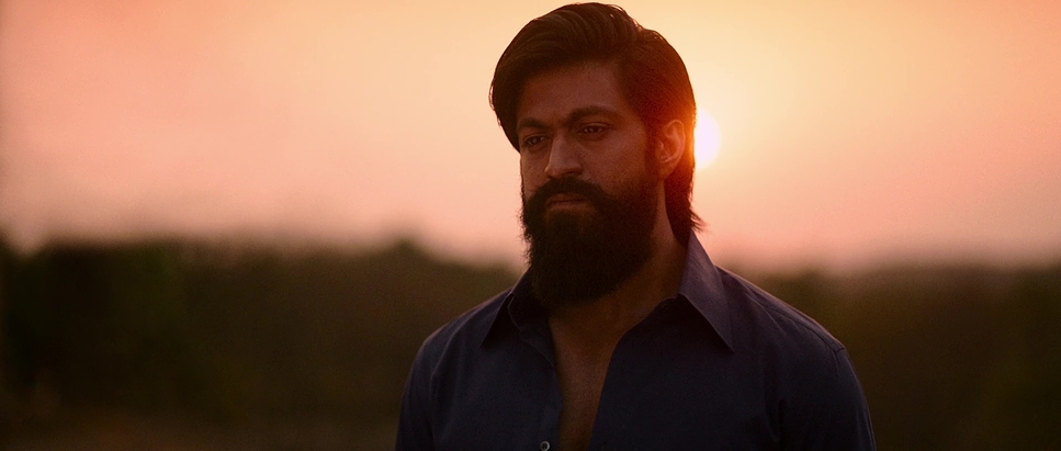
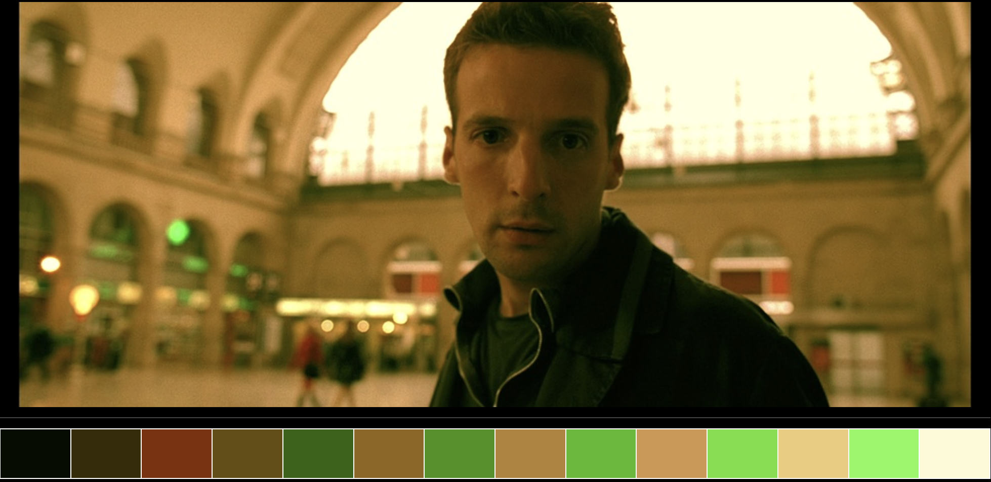
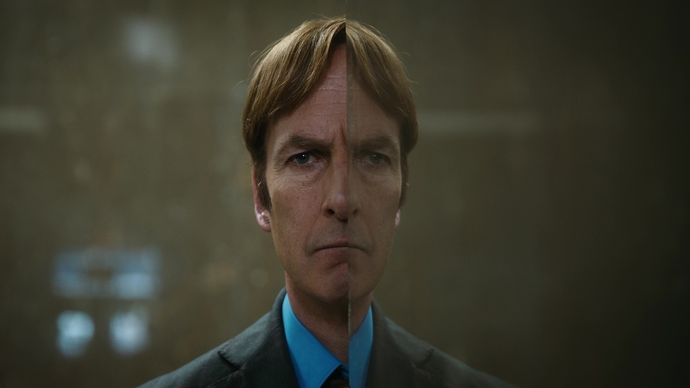
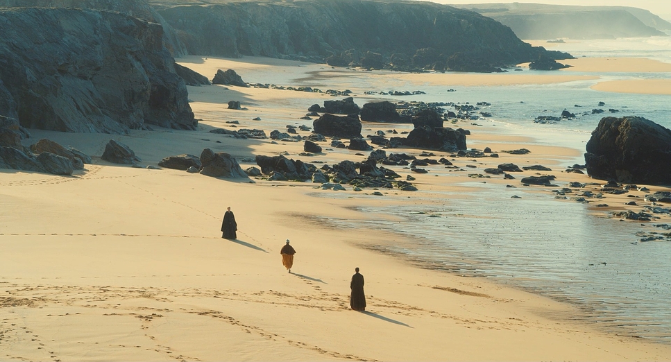
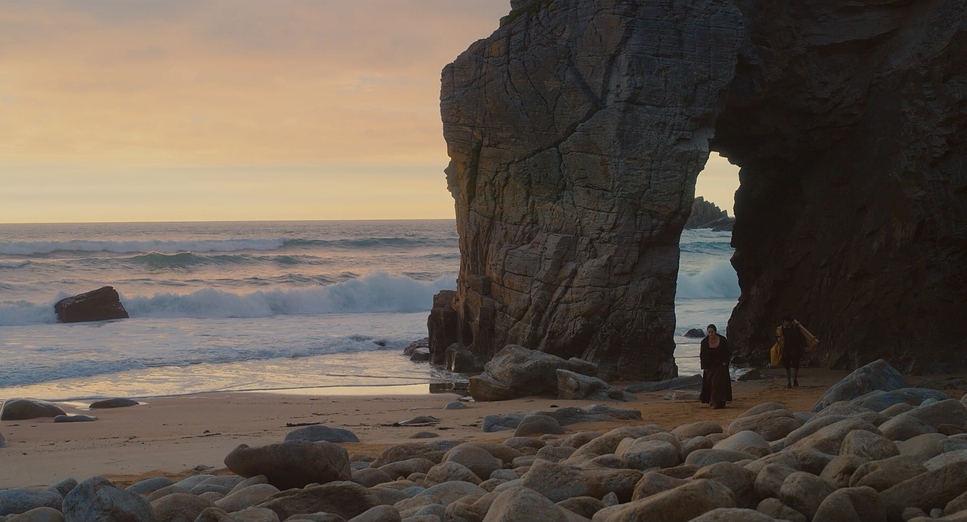
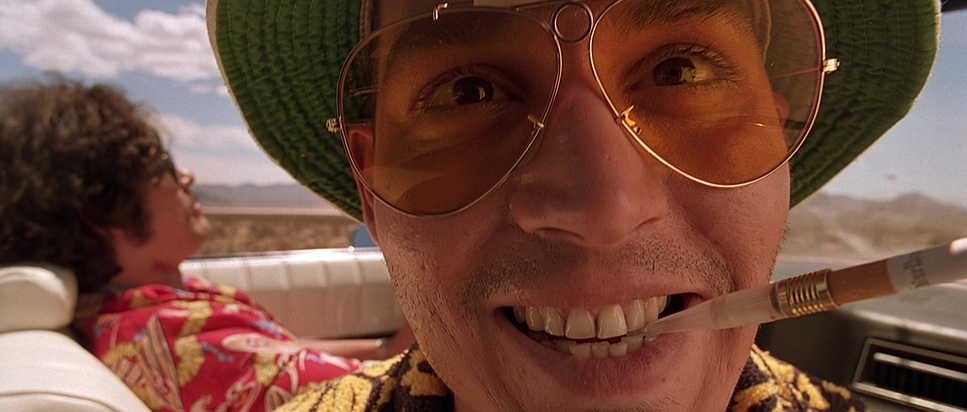
A mood board page rarely shows one single "correct" image — it juxtaposes several partial references, each contributing one quality (a light quality here, a palette there), because no single existing film or photograph is ever a full match for a new project's intended look.
Deeper DiveProcess & Collaboration
Reference images in a look book are almost never meant to be copied literally. A cinematographer pulling a still from another film is typically isolating one specific quality — "the intimacy of this framing," "the harshness of this daylight," "the grain and desaturation of this stock" — while explicitly discarding everything else about that reference. Presenting the reasoning alongside each image, not just the image itself, is what keeps a look book from being read as a request to imitate another film rather than a tool for articulating a new one.
For sequences that are unusually complex — large-scale action, heavy visual effects, or intricate camera choreography — productions often move a step further into previsualization ("previs"): rough, computer-generated animatics that block out camera movement, blocking, and cutting before a single frame is actually filmed. Previs became especially central to VFX-heavy filmmaking from the 2000s onward, letting a director and cinematographer test and revise an expensive sequence's visual plan cheaply, in software, long before the shoot.
Once the look book's visual direction is agreed on, that direction is validated technically through camera tests — dedicated prep days where the cinematographer shoots test footage on the actual camera, lens, and lighting package intended for production, then reviews it through the intended color pipeline. This is where abstract mood-board decisions about color and contrast get checked against how the specific camera/lens combination actually renders skin tone, highlight roll-off, and grain before the whole crew is committed to it on an expensive shooting day.
The look book's most granular descendant is the shot list and storyboard, which translate mood and reference into a literal, scene-by-scene plan of individual shots — see Shot Sizes for the master-shot/coverage method those documents are built around, and Editing & Continuity for how that plan anticipates the eventual cut.
Further Reading
- The Visual Story: Creating the Visual Structure of Film, TV, and Digital Media — Bruce Block. The standard text on planning a film's visual structure — contrast, color, and space — before production begins.
- Film Directing Shot by Shot: Visualizing from Concept to Screen — Steven D. Katz. A widely used guide to storyboarding, shot listing, and previsualization technique.
- Cinematography: Theory and Practice — Blain Brown (3rd ed., 2016). Includes chapters on developing and communicating a visual approach during prep.
- American Society of Cinematographers (ASC) — American Cinematographer regularly publishes prep-process interviews with working DPs, often excerpting look book references for specific films.